
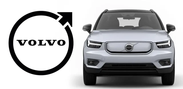
Actually, for the most part, the logo of the Swedish brand remained the same, but it was significantly simplified. Thus, the Volvo badge is now completely flat – on the rim, the brand arrow, and the letters there is no longer a three-dimensional effect. At the same time, gray and blue colors were replaced by just one color – black.
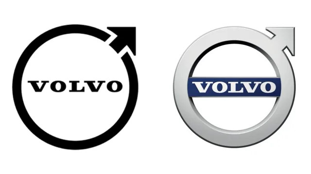
Volvo noted that the new logo will be used by all its divisions – passenger cars, trucks, buses, and even marine. However, this will happen no earlier than 2023 (it is in 2 years that the first car with the new emblem will appear).
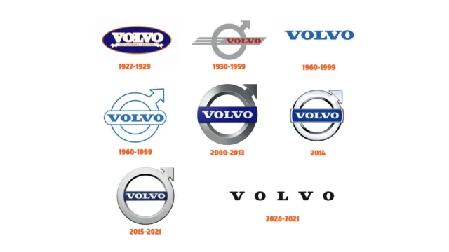
The famous circle with an arrow has been used by the Swedish brand since 1930. It is the Roman symbol of the God Mars, shield and spear, but for Volvo it has a slightly different meaning. In this way, the company emphasizes the achievements of its country in the steel industry, and also convinces people that its cars are reliable and strong as steel.
By the way, you can see what the new logos of Peugeot and Renault look like here and here. And here – take a look at the new Kia emblem.