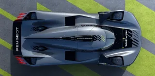
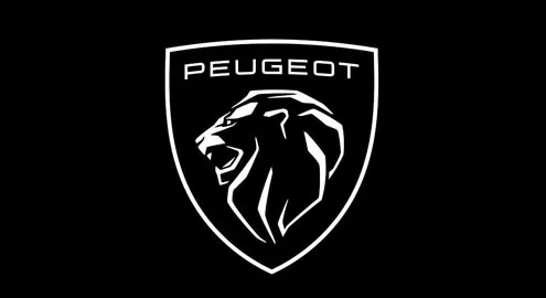
Yes, if earlier the Peugeot logo (which existed from 2010 to 2020) was an image of a lion in full growth, now the emblem features only the head of the “king of beasts” with an aggressively open mouth. Slightly above the lion's head is the inscription “Peugeot”, and the entire composition is placed in a heraldic shield. The old logo was made in a single silver color, while the new one is a combination of black and white.

At the same time, Peugeot abandoned the three-dimensional logo – the new emblem is absolutely flat. It is assumed that it will be convenient to hide radars and cameras of autonomous driving systems behind it.
According to the French, the new logo will mark the company's transition to a new era of electric mobility. But most importantly, it should make the Peugeot brand more recognizable, since few automakers use a shield-shaped brand mark.
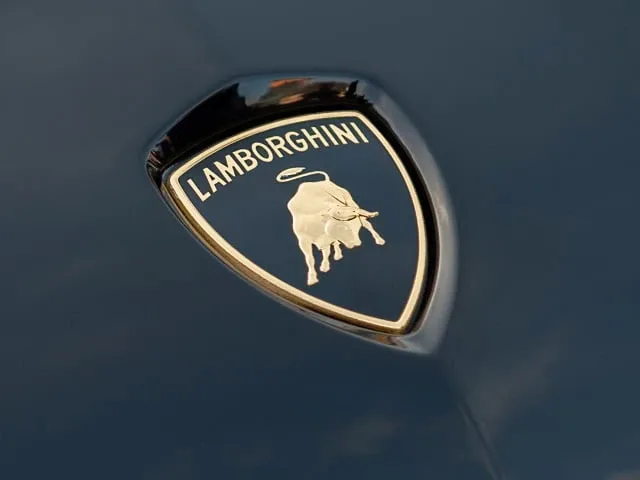
In this context, it is difficult not to mention the emblem of another famous automaker, Lamborghini. The Italians have a similar emblem: in the center of the heraldic shield is an angry bull, and directly above it is the brand name – “Lamborghini”. However, besides the animal image, the color scheme also differs: the sign of the famous brand from the Apennines is made in black and gold colors.
The first car to receive the new Peugeot logo will be the Peugeot 308 of the next generation, which will debut on March 18. After that, it will also decorate other new models of the brand. In addition, the new emblem will appear at branded dealerships – it will be used in pair with a new dark blue facade color scheme.