

The photo collage shows two Skoda logos: on the left is the current one, on the right is the new one. As you can see, they differ noticeably from each other. The latter is made in the spirit of minimalism: the traditional winged arrow has been replaced by a completely new element: the overall concept remains the same, but the arrow itself and the round logo border have disappeared.
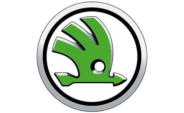
Current Skoda logo
The famous round logo with a winged arrow has been used by Skoda since 1926. During this time, the emblem has undergone two redesigns (the inscription "Skoda Auto" disappeared, a 3D effect appeared, etc.), but overall its appearance remains unchanged.
It is worth noting that earlier (in 2019) Skoda's parent company Volkswagen changed its logo. The concern abandoned the three-dimensional image, making the lines clearer and leaving the main elements.
The German automaker timed the logo update to the next era in its history – the era of electric vehicles.